
Your kitchen is more than just a place to cook—it’s where memories are made, and energy flows. Choosing the right color scheme can transform this space, making it feel inviting, lively, or calm—whatever you want it to be.
But how do you pick colors that truly reflect your style and boost your mood every time you step inside? You’ll discover simple, effective ways to decorate your kitchen with colors that work perfectly for you. Ready to turn your kitchen into a space you love?
Let’s dive in.
Choosing The Right Color Palette
Colors set the mood in your kitchen. Picking the right palette makes it cozy and inviting.
Think about how colors work together before you start painting or decorating.
Understand Color Types
Colors come in three types: primary, secondary, and neutral. Each has a role in design.
Primary colors like red, blue, and yellow are bold and bright. Neutral colors like white and gray calm the space.
- Primary colors are strong and eye-catching
- Secondary colors come from mixing primaries
- Neutral colors balance bright colors
Pick A Base Color
Choose one main color for walls or cabinets. This color sets the tone for the kitchen.
Light colors make the space look bigger. Dark colors add warmth and depth.
- Light blue or green for a fresh feel
- Warm beige or cream for a cozy space
- Dark gray or navy for a modern look
Add Accent Colors
Accent colors highlight features like backsplashes or kitchen islands. They add interest.
Use brighter or contrasting colors to make accents stand out against the base.
- Red or orange accents create energy
- Soft yellow or teal add cheer
- Metallics like gold or copper bring shine
Balance Warm And Cool Colors
Warm colors feel cozy and inviting. Cool colors feel calm and clean.
Mix warm and cool tones to keep the kitchen balanced and pleasant.
- Warm tones: red, orange, yellow
- Cool tones: blue, green, purple
- Use neutrals to soften the mix
Consider Lighting Effects
Natural and artificial light change how colors look. Test colors in different lights.
Bright light makes colors look lighter. Dim light makes colors look deeper.
- Check colors in daylight and at night
- Use lighting to highlight colors and features
- Choose finishes that reflect or absorb light
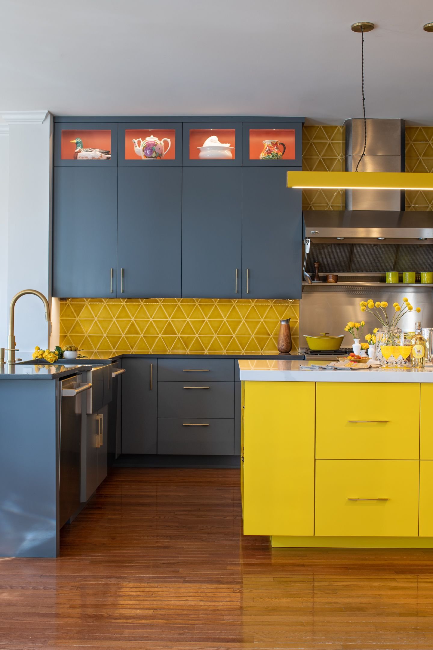
Incorporating Bold Hues
Using bold colors can bring energy and personality to your kitchen. Bright hues make the space feel lively and unique.
Bold colors work well on walls, cabinets, or accessories. They add contrast and create a focal point in your kitchen.
Choose A Strong Color Palette
Select two or three bold colors that complement each other. This keeps the design balanced and pleasing to the eye.
- Pick a dominant color for large areas like walls or cabinets
- Use a secondary color for smaller surfaces or appliances
- Add an accent color in details like handles or backsplashes
Balance Bold Colors With Neutrals
Pair bright hues with neutral tones to avoid overwhelming the space. Neutral colors soften the boldness and create harmony.
| Bold Color | Neutral Pairing |
| Deep Red | Light Gray |
| Bright Blue | White |
| Vibrant Yellow | Beige |
| Emerald Green | Cream |
Use Bold Colors In Kitchen Accessories
Incorporate bright colors through small items. This adds pops of color without major changes.
Try these colorful kitchen accessories:
- Vibrant dish towels
- Brightly colored cookware
- Bold patterned rugs
- Colorful bar stools
Paint Cabinets With Bold Colors
Painting cabinets in bold colors creates a strong visual statement. Choose durable paint made for kitchen use.
- Clean and sand cabinets before painting
- Use primer to ensure even color
- Apply two coats of bold paint
- Finish with a protective clear coat
Neutrals For A Timeless Look
Neutral colors create a calm and classic kitchen space. They work well with many styles and stay popular over time.
Using neutrals lets you change small details without repainting or remodeling. This makes your kitchen feel fresh for years.
Soft Whites For Clean And Bright Spaces
Soft white walls or cabinets make kitchens look bigger and lighter. White pairs well with wood and metal finishes.
White also works as a great background for colorful accessories or plants. It helps keep the kitchen feeling fresh.
Warm Beiges For Cozy Atmospheres
Beige tones add warmth without being too dark. They make kitchens feel welcoming and comfortable.
Use beige on walls, countertops, or backsplashes to create a soft, natural look that lasts through trends.
Gray Shades For Modern Elegance
Gray is a popular neutral that brings a modern edge. It works well with stainless steel and glass elements.
Light gray keeps the space bright, while darker gray adds depth. Combine different shades for a balanced look.
Earthy Browns For Natural Feelings
Brown tones remind us of nature and wood. They create a grounded and peaceful kitchen space.
Use brown in furniture, floors, or accents to add richness without overwhelming the room.
Mixing Neutrals For Depth
Combining different neutral tones adds interest and depth to your kitchen design. Avoid using just one color.
- Pair warm beiges with soft whites for balance
- Use gray with brown for a modern natural look
- Layer light and dark neutrals for contrast

Credit: www.youtube.com
Accent Walls And Backsplashes
Adding color to your kitchen can make it more lively and inviting. Accent walls and backsplashes are great ways to use color without overwhelming the space.
These areas allow you to bring in bold colors or interesting patterns. They create focus points that improve the kitchen’s style.
Using Accent Walls In The Kitchen
An accent wall is one wall painted a different color than the rest. It adds depth and interest to the kitchen.
Choose a color that stands out but matches your kitchen’s overall theme. This wall can be behind the dining area or near the cooking space.
- Pick a bold or dark color for contrast
- Use lighter shades for a subtle effect
- Consider textured paint or wallpaper for style
- Keep other walls neutral to balance the look
Choosing Colors For Backsplashes
Backsplashes protect walls and add color near the cooking and sink area. They can be simple or decorative.
Pick colors that complement your countertop and cabinets. Bright colors can brighten the space, while soft tones keep it calm.
- Use tiles in colors like blue, green, or red
- Try patterns like subway tiles or mosaics
- Glossy tiles reflect light and brighten the kitchen
- Matte tiles create a modern, soft look
Combining Accent Walls And Backsplashes
Use both accent walls and backsplashes to create a balanced color scheme. They can work together to highlight different kitchen areas.
Choose colors that either match or contrast nicely. This approach adds personality without making the space too busy.
- Match backsplash color with accent wall for unity
- Use contrasting colors for a bold statement
- Keep other elements neutral to avoid clashes
- Test colors in natural light before finalizing
Cabinet And Countertop Combinations
Choosing the right cabinet and countertop colors can change your kitchen’s look. The colors should match and balance well.
Good combinations can make your kitchen feel bigger, brighter, or cozier. Think about your style and kitchen size.
Classic White Cabinets With Dark Countertops
White cabinets bring a clean and fresh look. Dark countertops add contrast and depth. This combo works well in many kitchens.
Bold Cabinets With Neutral Countertops
Strong colors like navy or forest green on cabinets stand out. Pair them with neutral countertops like beige or light gray to balance the space.
Wood Cabinets With Stone Countertops
Wood cabinets offer warmth and natural beauty. Stone countertops, such as granite or quartz, add texture and durability.
- Light wood with white or cream stone
- Dark wood with black or dark gray stone
- Medium wood with speckled or patterned stone
Two-tone Cabinets With Simple Countertops
Use two cabinet colors to add interest. Keep countertops simple to avoid clashing.
| Cabinet Color Top | Cabinet Color Bottom | Countertop Color |
| Light Gray | Charcoal | White Marble |
| Soft Blue | White | Light Beige |
| Matte Black | Natural Wood | Concrete Gray |
Monochromatic Schemes
Using shades of the same color creates a calm and smooth look. For example, pale blue cabinets with a darker blue countertop.
Tip:Test color samples in your kitchen lighting before final choice.

Credit: www.goodhousekeeping.com
Flooring And Color Harmony
Choosing the right flooring is key to creating a kitchen with great color harmony. The floor sets the base for all other colors in the room.
Matching floor colors to your kitchen’s color scheme helps the space feel balanced and inviting.
Selecting Flooring Colors
Pick flooring colors that either match or complement your cabinets, walls, and countertops. Neutral tones like beige, gray, or soft browns work well with many schemes.
- Light floors make the kitchen look bigger and brighter.
- Dark floors add warmth and a cozy feeling.
- Natural wood tones bring texture and style.
- Colored tiles can add a fun or bold touch.
Creating Color Harmony With Flooring
Color harmony means all colors in the kitchen look good together. The floor color should blend with other colors to avoid clashes.
| Flooring Color | Best Matching Colors | Effect in Kitchen |
| Light Oak | White, Soft Gray, Pastel Blue | Airy and open feeling |
| Dark Walnut | Cream, Warm Red, Olive Green | Warm and inviting space |
| Gray Tile | Black, White, Bright Yellow | Modern and sleek look |
| Colored Tiles | Neutral Walls and Cabinets | Bold and playful accent |
Tips For Balancing Floor And Wall Colors
Use these simple tips to keep your kitchen colors balanced and pleasant.
- If floors are dark, choose lighter walls to brighten the space.
- Match floor tones with wood furniture or cabinet colors.
- Use rugs to add contrast without changing the floor.
- Test colors in natural light before deciding.
Lighting To Enhance Colors
Lighting plays a big role in how kitchen colors look. It can make colors appear bright or dull. Choosing the right light helps your kitchen look beautiful.
Different light types change the mood and feel of the kitchen. You can use a mix of lights for the best effect.
Natural Light
Natural light shows true colors best. Large windows or skylights bring in sunlight that makes colors pop. It also creates a fresh and open feel in the kitchen.
Warm And Cool Lighting
Warm lights have a yellow tone and make colors look cozy. Cool lights have a blue tone and make colors look crisp. Use warm light for reds and oranges. Use cool light for blues and greens.
Layered Lighting
Use different types of lights at once. This includes overhead lights, under-cabinet lights, and pendant lights. Layered lighting adds depth and highlights color details.
- Overhead lights give general brightness
- Under-cabinet lights brighten work surfaces
- Pendant lights add style and focus
Light Bulb Color Temperature
Color temperature is measured in Kelvins (K). It affects how colors show under light. Choose the right temperature to match your kitchen colors.
| Kelvin | Light Type | Best For |
| 2700K–3000K | Warm White | Warm colors like red, orange |
| 3500K–4100K | Neutral White | Balanced color tones |
| 5000K–6500K | Cool White/Daylight | Cool colors like blue, green |
Avoid Harsh Shadows
Harsh shadows can change how colors look. Use diffused lighting or multiple light sources. This softens shadows and keeps colors true.
Tip:Use dimmable lights to adjust brightness. This lets you change color mood anytime.
Color In Kitchen Accessories
Color plays a big role in decorating your kitchen. It can make your space feel warm or cool, bright or calm.
Using color in kitchen accessories is an easy way to add style. Small items can create a big impact.
Choosing The Right Colors
Pick colors that match your kitchen walls and cabinets. Bold colors add energy. Soft colors create a relaxed mood.
Types Of Colorful Kitchen Accessories
- Utensils like spatulas and spoons
- Dish towels and oven mitts
- Small appliances such as toasters and kettles
- Storage jars and containers
- Tableware including plates and cups
Mixing And Matching Colors
Combine different colors to create interest. Use a main color and add one or two accent colors.
| Accessory | Main Color | Accent Colors |
| Utensils | Red | White, Black |
| Dish Towels | Blue | Gray, Yellow |
| Small Appliances | Green | Silver, White |
| Storage Jars | Clear | Colorful Lids |
| Tableware | White | Pastel Tones |
Keeping Color Balanced
Too many colors can look messy. Use color in small doses. Let neutral tones balance bright colors.
Tip:Change your kitchen’s look easily by swapping colorful accessories with the seasons.
Seasonal Color Updates
Changing your kitchen colors with the seasons keeps your space fresh and lively. You can easily update your kitchen without major changes.
Using seasonal color schemes helps match the mood of each time of year. It also makes your kitchen feel cozy and inviting.
Spring Colors
Spring brings soft and bright colors like light green, pastel pink, and pale yellow. These colors refresh the kitchen and add a natural feel.
- Use pastel dish towels and curtains
- Add fresh flowers in vases
- Display light-colored ceramics
Summer Colors
Summer colors are bold and vibrant. Think about bright blues, sunny oranges, and lively reds. These colors bring energy to your kitchen.
- Use colorful placemats and rugs
- Hang bright artwork or prints
- Incorporate fresh fruit bowls with red and orange fruits
Fall Colors
Fall colors include warm tones like burnt orange, deep red, and mustard yellow. These colors create a cozy and inviting kitchen space.
| Color | Use Ideas |
| Burnt Orange | Kitchen towels and cushions |
| Deep Red | Wall decor or small appliances |
| Mustard Yellow | Tableware and vases |
Winter Colors
Winter colors are cool and calm. Use shades like icy blue, silver, and soft gray. These colors make your kitchen feel peaceful and clean.
Winter Decor Tips:
- Add silver or white candle holders
- Use soft gray kitchen towels
- Place blue glass jars on shelves
Credit: www.hgtv.com
Inspiration From Nature
Nature offers many beautiful color ideas for kitchen decoration. You can use natural colors to create a calm and fresh space.
Look at plants, water, and earth tones to find colors that work well together. These colors can make your kitchen feel warm and inviting.
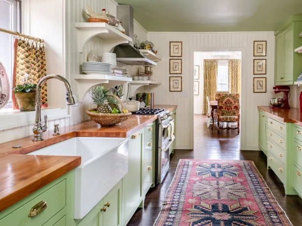
Earthy Tones
Earthy colors like browns, tans, and greens bring a natural look to your kitchen. These colors remind us of soil, leaves, and trees.
Use these tones on walls, cabinets, or kitchen accessories to create a warm and cozy feel.
- Soft brown cabinets
- Olive green accents
- Beige or tan walls
Ocean Blues
Blue shades inspired by the sea bring calmness and freshness to your kitchen. They work well with white or sandy colors.
Try light blues for walls or darker blues for furniture to add depth and interest.
- Light blue walls
- Navy blue cabinets
- White countertops
Floral Brights
Bright colors from flowers can add energy and life to your kitchen. Think of reds, yellows, and pinks inspired by blooms.
Use these colors carefully to keep your kitchen cheerful without feeling too busy.
- Yellow kitchen towels
- Red flower pots
- Pink or coral backsplash tiles
Stone And Mineral Shades
Colors from stones and minerals, like grays and soft whites, give a clean and modern look. These colors are perfect for a sleek kitchen design.
Pair these shades with natural wood for balance and warmth.
- Gray countertops
- White cabinets
- Wooden shelves or flooring
Frequently Asked Questions
What Are The Best Color Schemes For A Kitchen?
Popular kitchen color schemes include neutral tones, pastels, and bold contrasts. Neutrals create a timeless look, pastels add softness, and bold colors bring energy. Choose schemes that match your style and lighting for a balanced kitchen atmosphere.
How Do I Choose A Kitchen Color Scheme?
Consider your kitchen size, lighting, and existing decor. Light colors make small kitchens appear larger, while darker shades add warmth. Test paint samples and choose colors that complement your cabinets and appliances for a cohesive look.
Can Color Schemes Affect Kitchen Mood?
Yes, colors influence mood and appetite. Warm colors like red and orange stimulate energy and hunger. Cool colors like blue and green promote calmness and cleanliness. Select colors that match the atmosphere you want in your kitchen.
How To Combine Colors In Kitchen Decor?
Use the 60-30-10 rule: 60% main color, 30% secondary, 10% accent. This balance creates harmony and visual interest. Combine colors with different textures and finishes for depth without overwhelming the space.
Conclusion
Choosing the right color scheme can brighten your kitchen space. It sets the mood and shows your style clearly. Simple tips help you mix and match colors easily. Think about light, warmth, and balance in your design. Small changes can make a big difference in how your kitchen feels.
Enjoy creating a space that feels fresh and inviting every day. Your kitchen can become a happy place to cook and gather. Color brings life and energy to this important room.