
Choosing the right colors for your kitchen can change everything. It sets the mood, highlights your style, and makes cooking and gathering more enjoyable.
But how do you pick a color palette that feels fresh, modern, and uniquely yours? This guide will help you design a contemporary kitchen color palette that brings your space to life. By the end, you’ll know exactly how to mix shades that create harmony and make your kitchen the heart of your home.
Ready to transform your kitchen with colors that inspire? Let’s dive in.
Understanding Contemporary Kitchen Aesthetics
Contemporary kitchens focus on clean lines and simple shapes. They use colors that feel fresh and modern.
Choosing the right color palette helps create a calm and stylish space. It also highlights the kitchen’s design features.
Key Features Of Contemporary Kitchen Design
Contemporary kitchens often include smooth surfaces and minimal decoration. The use of light and space is important to the overall look.
- Flat-panel cabinets with sleek hardware
- Neutral colors with bold accents
- Simple and functional lighting
- Open floor plans with plenty of natural light
Choosing Colors For A Modern Look
Neutral colors like white, gray, and beige form the base of most contemporary kitchens. These colors make the space feel open and bright.
Accent colors add interest and personality. These can be seen in backsplashes, accessories, or furniture.
| Color Type | Purpose | Examples |
| Neutral | Base color for walls and cabinets | White, Gray, Beige |
| Accent | Adds contrast and style | Black, Navy Blue, Emerald Green |
| Metallic | Modern touch with reflections | Brushed Nickel, Chrome, Matte Black |
Materials And Color Coordination
Materials affect how colors look in the kitchen. Wood, metal, and stone give different textures and shades.
Tip:Pair light wood with warm neutral colors. Use dark metals with cool tones for balance.

Credit: www.magnet.co.uk
Choosing A Base Color
Choosing the right base color is key to creating a modern kitchen look. The base color sets the mood and style for the whole space.
Think about how the color will work with your cabinets, walls, and lighting. A good base color makes everything else stand out.
Neutral Shades
Neutral shades are safe and timeless choices for a kitchen base. They create a calm and clean backdrop that pairs well with many styles.
- Light gray adds a sleek and modern feel.
- Soft beige warms up the space gently.
- Classic white brightens the room and feels fresh.
- Muted taupe blends well with natural materials.
Bold Base Options
Bold colors make your kitchen stand out and show personality. They work well when balanced with neutral accents.
| Color | Effect | Pairing Tips |
|---|---|---|
| Navy Blue | Rich and deep | Use with white or gold hardware |
| Forest Green | Earthy and calming | Pair with wood textures and brass |
| Charcoal Black | Strong and dramatic | Balance with light countertops and bright lighting |
| Burnt Orange | Warm and energetic | Combine with natural stone and neutral walls |
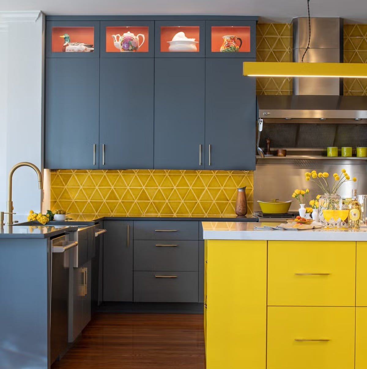
Incorporating Accent Colors
Choosing the right accent colors can change the whole look of a contemporary kitchen. Accent colors add personality and style without overwhelming the space.
Use accents to highlight features like cabinets, backsplashes, or kitchen islands. They bring energy and harmony to your kitchen design.
Vibrant Accent Ideas
Bright accent colors can make your kitchen lively and inviting. Use bold shades carefully to keep the space balanced and modern.
- Deep red accessories like bar stools or vases add warmth.
- Bright yellow light fixtures bring cheer and brightness.
- Turquoise backsplash tiles create a fresh, coastal feel.
- Orange kitchenware offers a pop of energy without clutter.
- Green plants in colorful pots add life and color.
Subtle Accent Choices
Soft accents create a calm and elegant kitchen. These colors work well with neutral palettes and add depth without distraction.
| Accent Color | Where to Use | Effect |
| Soft Gray | Counters or walls | Calm and clean look |
| Muted Blue | Cabinet handles | Subtle contrast |
| Warm Beige | Backsplash | Inviting warmth |
| Pastel Pink | Decor items | Gentle charm |
| Light Olive | Open shelves | Natural feel |
The Role Of Natural Light
Natural light changes the look of kitchen colors. It makes colors appear warm or cool. Good natural light can make a kitchen feel bigger and brighter.
Designing a kitchen color palette needs thinking about sunlight. The amount and direction of light affect your color choices.
Assessing Light Sources
Look at where natural light enters your kitchen. Check the size and place of windows and doors. Notice how sunlight moves during the day.
North-facing kitchens get soft, cool light. South-facing kitchens have bright, warm light. East windows bring morning sun. West windows get afternoon sun.
- Identify window directions
- Note sunlight hours
- Check shadows and brightness
- Consider obstacles outside like trees or buildings
Color Choices For Different Lighting
Choose colors that work well with your kitchen’s natural light. Light colors make small kitchens look larger. Dark colors add depth but need good light.
Warm light suits warm colors like yellows and reds. Cool light fits cool colors like blues and greens. Neutral colors work well in any light.
- Bright light: Try bold or dark colors
- Soft light: Use light or pastel colors
- Limited light: Pick reflective or warm tones
- Neutral light: Flexible for many colors
Texture And Material Coordination
Choosing the right textures and materials is key in a kitchen design. They help create a balanced and stylish look.
Combining colors with textures makes the kitchen feel more interesting and inviting.
Matching Colors With Materials
Different materials show colors in unique ways. Wood often warms up colors, while metal gives a cooler feel.
Use materials that support the mood you want. Light stones brighten, and dark metals add depth.
- Wood pairs well with earth tones like brown and beige
- Metal works with cool colors like gray, blue, and black
- Glass surfaces suit bright or clear colors
- Stone looks great with neutral and soft colors
Using Textures To Enhance Colors
Textures add life to colors. A rough texture can make a color look richer and more natural.
Smooth textures reflect light and make colors look brighter and cleaner.
- Matte surfaces soften bright colors
- Glossy finishes make dark colors shine
- Textured tiles add pattern and depth
- Natural fibers bring warmth to neutral shades

Credit: capitoldesignbuild.com
Seasonal And Timeless Trends
Choosing the right color palette is key for a modern kitchen design. Colors can reflect the seasons or stay classic year-round.
Understanding current seasonal trends and timeless choices helps you create a kitchen that feels fresh and inviting.
Current Seasonal Trends
Seasonal colors bring energy and mood changes to your kitchen. These shades often follow nature’s cycles and popular design updates.
- Spring: Soft pastels like mint green and blush pink
- Summer: Bright tones such as sunny yellow and coral
- Autumn: Warm shades like burnt orange and deep red
- Winter: Cool hues including icy blue and charcoal gray
Timeless Color Choices
Timeless colors suit any style and stay appealing over years. These shades create a calm and balanced kitchen environment.
| Color | Effect | Pairing Ideas |
| White | Clean and bright | Natural wood, stainless steel |
| Gray | Neutral and modern | Bold black, soft pastels |
| Beige | Warm and inviting | Earth tones, white |
| Navy Blue | Elegant and deep | Brass, light gray |
Expert Tips For A Cohesive Look
Choosing the right colors for a contemporary kitchen can create a stylish and inviting space. A good color palette balances tones and highlights the kitchen’s features.
Use simple ideas to make your kitchen look connected and neat. This guide helps you pick colors wisely and avoid common errors.
Balancing Colors And Space
Balance light and dark colors to keep the kitchen feeling open and warm. Use lighter shades on walls to make the space look bigger. Dark colors work well on cabinets or counters to add depth.
- Pick one main color for large areas like walls or floors.
- Choose two accent colors for cabinets or furniture.
- Add one or two small pops of bright color for interest.
- Keep metal finishes consistent to match your color choices.
Avoiding Common Mistakes
Many kitchens look unbalanced because colors clash or do not flow well. Avoid using too many bold colors at once. Too many patterns can also make the space feel busy and small.
| Mistake | How to Fix |
| Using too many bright colors | Limit bright colors to one or two accents only |
| Ignoring natural light | Choose colors that work well with sunlight in your kitchen |
| Mixing too many textures | Use smooth finishes and keep textures simple |
| Neglecting color flow | Repeat colors in small details to connect the space |

Credit: www.designcafe.com
Frequently Asked Questions
What Colors Define A Contemporary Kitchen Palette?
Contemporary kitchen palettes often feature neutral tones like white, gray, and black. Bold accents such as navy, emerald, or mustard add character. Metallic finishes also complement the modern look, creating a balanced and stylish space.
How To Choose Accent Colors For Contemporary Kitchens?
Select accent colors that contrast with your base hues. Use vibrant tones like teal, coral, or gold sparingly. This adds visual interest without overwhelming the minimalist design, maintaining a sleek and fresh kitchen atmosphere.
Can Contemporary Kitchen Colors Affect Mood And Functionality?
Yes, colors impact both mood and functionality. Light colors enhance brightness and space perception. Dark shades add depth but may reduce light. Choose colors that balance ambiance with practical kitchen use.
What Materials Pair Well With Contemporary Color Palettes?
Materials like stainless steel, glass, and matte wood complement contemporary colors. They add texture and modernity. These materials enhance the sleek, clean lines typical of contemporary kitchen designs.
Conclusion
Choosing the right colors shapes your kitchen’s style and mood. Think about light, space, and how colors mix. Soft tones create calm, while bold shades add energy. Balance bright and neutral colors for a fresh look. Use samples to see colors in your space first.
Your kitchen can feel warm, bright, or modern. Small changes make a big difference. Start with colors you love and enjoy the process. Designing a color palette is simple with clear steps. Your perfect kitchen awaits with the right colors.