
Choosing the perfect paint color for your kitchen can change the entire feel of your home. Whether you want a cozy space to relax or a bright area to energize your mornings, the right color makes all the difference.
You might be wondering which shades work best with your cabinets, lighting, and style. This guide will help you discover the best paint colors for kitchens that suit your taste and make your space truly inviting. Keep reading to find the color that speaks to you and transforms your kitchen into the heart of your home.
Choosing The Right Color Palette
Picking the right colors for your kitchen can change the whole look and feel of the space.
Colors affect mood and can make the kitchen look bigger, brighter, or cozier.
Understand Your Kitchen’s Lighting
Light changes how paint colors look. Natural light shows true colors, while artificial light can shift tones.
Choose colors that work well with your kitchen’s lighting to avoid unwanted shadows or dullness.
Consider The Kitchen Size
Light colors make small kitchens feel larger and open. Dark colors add warmth to big kitchens.
- Small kitchens: soft whites, pale blues, light grays
- Large kitchens: deep greens, navy blues, rich browns
- Medium kitchens: balanced shades of beige, soft yellows
Match Colors With Kitchen Fixtures
Look at your cabinets, countertops, and appliances. Pick paint colors that complement these elements.
| Fixture | Suggested Colors |
| White Cabinets | Soft gray, pale blue, mint green |
| Wood Cabinets | Warm beige, creamy white, olive green |
| Stainless Steel Appliances | Cool grays, navy, bright white |
Choose Colors That Fit Your Style
Think about the mood you want. Soft colors create calmness. Bright colors bring energy.
Examples of styles and colors:
- Modern: white, black, gray
- Farmhouse: cream, sage green, soft blue
- Traditional: warm taupe, burgundy, gold
Classic Whites And Off-whites
Classic whites and off-whites bring a timeless look to kitchens. They create a clean and bright space that feels open and fresh.
These colors work well with many styles and allow other design elements to stand out. They also reflect light, making kitchens feel larger.
Why Choose Classic Whites?
Classic white paints offer a pure and simple backdrop. They match well with any cabinet or countertop color. White walls help highlight kitchen fixtures and appliances.
- Brightens small kitchens
- Matches all kitchen styles
- Creates a clean and fresh look
- Reflects natural and artificial light
- Easy to pair with colorful accents
Popular Off-white Shades
Off-white colors add warmth and softness to kitchens. They are less stark than pure white and can hide dirt better. These shades create cozy and inviting spaces.
| Shade | Description | Best Use |
| Ivory | Soft and creamy | Traditional kitchens |
| Almond | Warm with light beige tones | Rustic or farmhouse styles |
| Eggshell | Light with a hint of gray | Modern or minimalist kitchens |
| Bone | Neutral and muted | Transitional kitchens |
Tips For Using Whites And Off-whites
Pair these colors with natural materials for balance. Wood, stone, and metal look great against white or off-white walls. Use texture to add interest.
- Choose matte or eggshell finishes to hide marks
- Add colorful accessories for contrast
- Use layered lighting to prevent flatness
- Combine different whites for depth
Warm Neutrals For Cozy Spaces
Warm neutral colors create a cozy and inviting kitchen. These shades bring comfort without being too bright or dull.
Using warm neutrals helps kitchens feel calm and welcoming. They work well with many styles and materials.
Soft Beige
Soft beige is a gentle color that adds warmth to kitchens. It pairs nicely with wood and white cabinets.
This color reflects light well, making small kitchens appear bigger and brighter.
Warm Taupe
Warm taupe blends brown and gray tones for a balanced look. It creates a relaxed and elegant kitchen space.
Use warm taupe on walls or kitchen islands for a soft, natural feel.
Creamy Off-white
Creamy off-white is warmer than plain white. It brings a soft glow to kitchen walls and cabinets.
This color brightens the space while keeping it cozy and inviting.
Light Caramel
Light caramel adds a touch of sweetness to kitchen walls. It gives a rich, warm look without being overpowering.
This shade works well with natural wood and dark countertops.
Muted Terracotta
Muted terracotta offers a soft earthy tone with warmth. It adds character and comfort to kitchen spaces.
This color pairs well with plants and rustic kitchen decor.
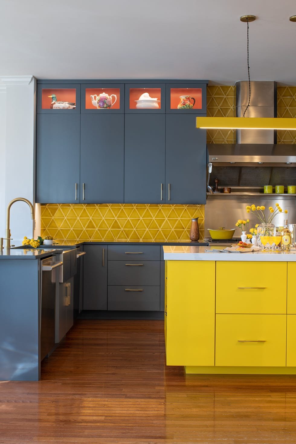
Bold Reds And Oranges
Bold reds and oranges bring energy to kitchen spaces. These colors add warmth and excitement.
Choosing the right shade can create a lively and welcoming kitchen. These colors work well in many styles.
Using Bold Reds In Kitchens
Bold red paints make a strong statement on kitchen walls. They create a warm and inviting atmosphere.
Red works well with white cabinets and stainless steel appliances. It adds a pop of color without overwhelming the space.
- Choose bright red for an energetic vibe
- Deep red adds a cozy and rich feel
- Pair red with neutral colors for balance
Adding Vibrant Oranges To Your Kitchen
Orange tones create a cheerful and lively kitchen environment. They brighten the space and lift the mood.
Use bold orange on accent walls or kitchen islands. It pairs nicely with wood and natural materials.
- Bright orange energizes the room
- Burnt orange gives a rustic, warm look
- Combine orange with light neutrals for contrast
Balancing Bold Colors In Kitchen Design
Balance bold reds and oranges with neutral tones. This keeps the kitchen from feeling too busy.
Use these colors on walls, backsplashes, or cabinets. Add neutral furniture and flooring to soften the look.
- Mix bold colors with white or gray
- Add natural wood elements for warmth
- Use soft lighting to create a cozy feel
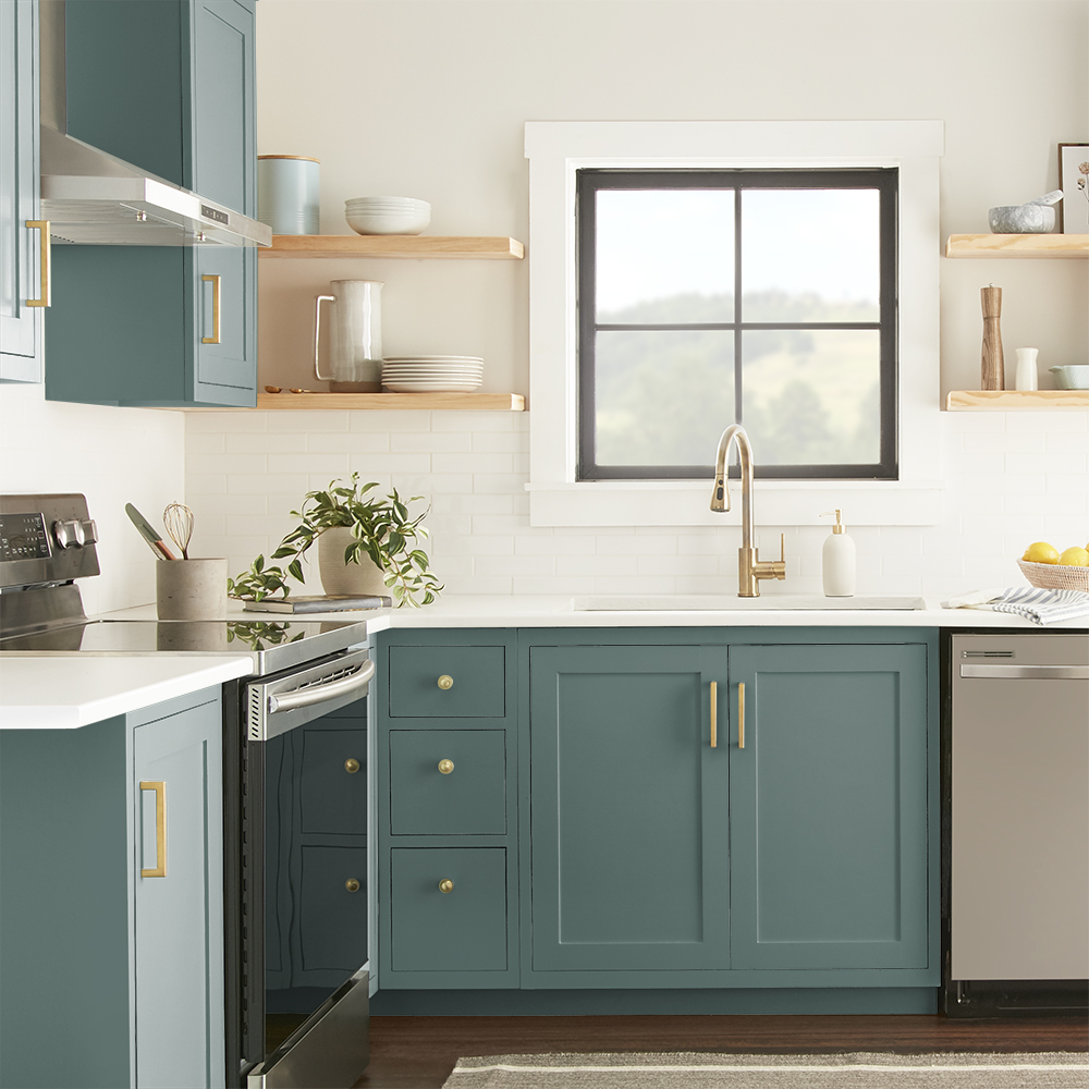
Cool Blues And Greens
Cool blues and greens create a calm and fresh kitchen space. These colors bring nature’s peace inside your home.
They work well with many kitchen styles, from modern to classic. These shades can make the kitchen feel larger and brighter.
Soft Blue Shades
Soft blues add a gentle touch to your kitchen walls. They create a relaxing atmosphere that helps you enjoy cooking and eating.
- Powder blue brightens small kitchens
- Sky blue pairs well with white cabinets
- Light teal adds a hint of green for freshness
Fresh Green Tones
Green tones bring the feeling of nature indoors. They work great with wood and stone surfaces in the kitchen.
| Green Shade | Best For | Pairing Colors |
| Sage Green | Cabinetry and walls | Beige, cream, and wood tones |
| Mint Green | Backsplashes and accents | White, light gray, and soft blues |
| Seafoam Green | Open shelves and accessories | Natural wood and pale yellow |
Combining Blues And Greens
Mixing blues and greens brings harmony to your kitchen color scheme. Use them in different tones to add depth.
Try these tips for combining cool colors:
- Use blue on walls and green on cabinets
- Add green plants to complement the colors
- Choose blue or green kitchenware for accents
- Keep countertops neutral to balance colors
Elegant Grays And Charcoals
Gray and charcoal paint colors bring a calm and stylish look to kitchens. These colors work well with many designs and styles.
They create a cozy yet modern space that feels clean and fresh. These shades highlight kitchen features without being too bold.
Soft Gray Tones
Soft grays add light and brightness to your kitchen. They are gentle on the eyes and make the room feel bigger.
These tones work great with white cabinets and natural wood accents. They create a balanced and welcoming space.
Deep Charcoal Shades
Deep charcoal colors bring drama and depth to kitchen walls. They make light features and metals stand out.
Charcoal works well in modern kitchens with stainless steel appliances. It adds a strong, elegant feel to the room.
Pairing Grays And Charcoals
Combining soft grays with charcoals creates contrast and interest. Use gray on walls and charcoal on cabinets for balance.
- Soft gray walls brighten the space
- Charcoal cabinets add rich color
- White countertops keep the look fresh
- Wood or metal accents add warmth
Choosing The Right Finish
Matte finishes soften gray and charcoal colors. They hide fingerprints and smudges well in kitchens.
Semi-gloss finishes add shine and reflect light. They are easier to clean on cabinets and trim.
Earthy Tones For Natural Vibes
Earthy tones bring calm and warmth to kitchen spaces. These colors reflect nature and create a cozy feel.
Using earthy colors in kitchens helps connect indoor spaces with the outdoors. It makes the room feel fresh and inviting.
Warm Browns
Warm brown shades add a rich and natural look to kitchens. They pair well with wooden cabinets and stone countertops.
These tones make kitchens feel grounded and comfortable. They work well in both modern and traditional styles.
Soft Greens
Soft green colors bring freshness and calmness to kitchen walls. They remind us of plants and nature.
Green tones blend nicely with natural wood and white elements. They brighten the space without being too bold.
Muted Terracotta
Muted terracotta adds warmth with a subtle orange-red hue. It creates a cozy and earthy atmosphere.
This color pairs well with cream and beige accents. It gives kitchens a welcoming and rustic charm.
Soft Beige And Taupe
Soft beige and taupe offer neutral backgrounds that feel natural and light. They open up small kitchen spaces.
These colors work well with both dark and light furniture. They create a calm and balanced kitchen look.
Deep Olive
Deep olive green adds depth and richness to kitchen walls. It brings a strong connection to nature.
This color works great as an accent on cabinets or walls. It pairs well with wooden textures and brass hardware.

Credit: www.goodhousekeeping.com
Pastel Shades For A Soft Touch
Pastel colors bring calm and warmth to kitchens. They create a gentle and welcoming space.
These soft shades work well with many kitchen styles. They add light without overwhelming the room.
Why Choose Pastel Colors?
Pastel tones make kitchens feel cozy and bright. They reflect natural light and open up small spaces.
These colors also pair well with wood, white cabinets, and metal finishes. They offer a fresh look without boldness.
Popular Pastel Shades For Kitchens
- Soft Mint Green
- Light Peach
- Powder Blue
- Blush Pink
- Lavender
Each color adds its own charm. Mint green feels fresh and clean. Peach warms the space gently.
How To Use Pastels In Kitchen Design
| Kitchen Element | Pastel Color Idea | Effect |
| Walls | Powder Blue | Calming and spacious |
| Cabinets | Blush Pink | Soft and elegant |
| Backsplash | Light Peach | Warm and inviting |
| Accessories | Lavender | Subtle and charming |
Tips For Matching Pastel Colors
Use neutral tones like white or gray with pastels. This keeps the kitchen bright and balanced.
Design Tip:Combine pastel colors with natural wood textures for a warm, soft kitchen look.
Two-tone Combinations
Two-tone paint colors add depth and style to kitchen spaces. They create visual interest without overwhelming the room.
Using two colors can highlight different areas or features. This approach suits many kitchen designs and sizes.
Classic White And Navy Blue
White and navy blue is a timeless combo. White on upper cabinets keeps the space bright. Navy blue on lower cabinets adds richness.
Soft Gray And Warm Wood Tones
Soft gray walls paired with warm wood cabinets create a cozy feel. This mix balances cool and warm shades well.
- Gray walls brighten the room
- Wood cabinets add natural texture
- Works well with stainless steel appliances
Bold Black And Crisp White
Black and white is a sharp, modern choice. Use black for lower cabinets and white above to keep the kitchen open.
Warm Beige And Sage Green
Warm beige walls with sage green cabinets create a calming effect. This combo works great for nature-inspired kitchens.
| Color Combination | Use For | Effect |
| White & Navy Blue | Upper & Lower Cabinets | Bright and Rich |
| Soft Gray & Wood | Walls & Cabinets | Cozy and Balanced |
| Black & White | Lower & Upper Cabinets | Modern and Sharp |
| Beige & Sage Green | Walls & Cabinets | Calming and Natural |
Accent Walls For A Pop Of Color
Accent walls add color and style to kitchens. They break the space and make it lively.
Choosing the right paint color can highlight features and create a warm mood.
Bold Reds For Energy
Red shades bring energy and warmth to your kitchen. They work well on one wall.
Try cherry red or brick red for a strong, lively look that grabs attention.
Cool Blues For Calm
Blue tones create a calm and fresh feeling in the kitchen. They are great for accent walls.
Use navy or sky blue to add contrast without overwhelming the space.
Warm Yellows For Cheerfulness
Yellow makes kitchens feel bright and happy. It works well to highlight one wall.
Soft butter yellow or mustard can add a cozy and inviting touch.
Deep Greens For Nature
Green shades bring a natural and fresh vibe to kitchens. They look great on accent walls.
Try forest or olive green for a rich and earthy effect.
Soft Grays For Modern Style
Gray tones give kitchens a clean and modern look. They balance bright colors well.
Use light or charcoal gray to add depth without strong color contrast.
Tips For Small Kitchens
Small kitchens need smart color choices to feel open and bright. The right paint colors can make your space look larger and more inviting.
Choosing paint that reflects light and matches your style helps create a pleasant cooking area. Keep your kitchen fresh with these tips.
Use Light And Neutral Colors
Light colors open up small spaces. Whites, creams, and soft grays reflect more light and make your kitchen feel bigger.
Add A Pop Of Color
Bright colors can add personality without crowding the space. Use them on an accent wall or kitchen cabinets to keep the room lively.
- Soft blues for a calm feel
- Light greens for freshness
- Warm yellows for cheerfulness
Choose Glossy Or Satin Finishes
Glossy and satin paints reflect light better than matte finishes. They add shine that can make walls and cabinets appear larger.
Use Color To Define Zones
Paint different areas in matching or complementary colors to create zones. This method helps organize a small kitchen visually.
| Kitchen Zone | Suggested Color |
| Cooking Area | Soft Gray |
| Eating Nook | Light Blue |
| Storage | Warm Beige |
Keep Ceilings And Trims Light
Paint ceilings and trims in white or very light shades. This lifts the room and makes the ceiling feel higher.
Tip:Use the same light color on ceilings and trims for a seamless look that expands the space.
Lighting Considerations
Lighting plays a big role in choosing paint colors for kitchens. It affects how colors look on walls and cabinets.
Different types of lighting can change the mood and feel of your kitchen space. Knowing this helps you pick the right colors.
Natural Light
Natural light comes from windows and skylights. It changes throughout the day, affecting paint colors.
Bright natural light shows true colors well. Darker colors look rich, while light colors appear fresh and open.
Artificial Light Types
- Incandescent bulbs:Give a warm, yellow glow. They make warm paint colors look cozy.
- Fluorescent bulbs:Cast a cool, blue light. They can make warm colors look dull and cold colors look bright.
- LED bulbs:Come in many shades. Choose warm or daylight LEDs to match your paint color mood.
Room Orientation
| Orientation | Lighting Effect | Recommended Paint Colors |
| North-facing | Cool, soft light | Warm tones like creams and soft yellows |
| South-facing | Bright, warm light | Cool colors like blues and greens |
| East-facing | Bright morning light | Light, fresh colors like pastel blues and pinks |
| West-facing | Warm evening light | Rich colors like deep reds and oranges |
Gloss And Finish Impact
Shiny or matte paint finishes reflect light differently. Glossy finishes reflect more light and brighten the room.
Matte finishes absorb light and soften the color look. Pick the finish based on your lighting and style.
Use Of Accent Lighting
Accent lighting highlights certain areas and colors. Use under-cabinet lights or spotlights to make paint colors pop.
- Highlight backsplash colors
- Make dark walls stand out
- Create cozy corners with warm light
Incorporating Trends
Choosing paint colors for kitchens is a fun way to update the space. Trends change often, so it helps to know what is popular now.
This guide shows how to use current paint color trends in your kitchen. The ideas are simple and easy to follow.
Earthy Tones For Warmth
Earthy tones bring a warm and natural feel to kitchens. Colors like soft browns, greens, and clay add comfort.
These colors match wood and stone materials well. They create a calm and cozy place for cooking and eating.
Bold Dark Colors
Dark colors such as navy blue, charcoal, and black are popular for kitchens. They add drama and make light areas stand out.
Use these colors on walls or cabinets for a modern look. Pair dark colors with light countertops or backsplashes.
Soft Pastels For Freshness
Soft pastel colors like mint green, pale pink, and light blue bring freshness to kitchens. They feel light and airy.
Pastels work well in small kitchens or those with lots of natural light. They create a happy and inviting space.
Two-tone Color Schemes
Using two colors in the kitchen adds interest and style. One color can go on upper cabinets, another on lower ones.
Choose colors that complement each other. This trend lets you mix dark and light or warm and cool tones.
- Dark blue with white
- Soft gray with pale yellow
- Earthy green with tan
Matte Finishes For Modern Look
Matte paint finishes are trendy for kitchen walls and cabinets. They reduce shine and give a smooth, soft look.
This finish hides fingerprints and small marks better than glossy paint. It works well with both light and dark colors.

Credit: www.goodhousekeeping.com
)
Credit: www.homedepot.com
Frequently Asked Questions
What Are The Most Popular Kitchen Paint Colors?
Popular kitchen paint colors include soft whites, light grays, and warm beige tones. These colors create a clean, bright, and welcoming atmosphere, complementing various kitchen styles from modern to traditional.
How Do I Choose Paint Colors For A Small Kitchen?
For small kitchens, choose light and neutral colors like pale blues or soft grays. These shades make the space feel larger and airier, enhancing natural light and reducing visual clutter.
Which Paint Colors Increase Kitchen Resale Value?
Neutral colors such as whites, grays, and taupes boost kitchen resale value. They appeal to a broad audience and provide a versatile backdrop that fits many design preferences.
Can Bold Paint Colors Work In Kitchens?
Yes, bold colors like navy blue, emerald green, or deep red can work well. Use them as accent walls or cabinetry colors to add personality without overwhelming the space.
Conclusion
Choosing the right paint color sets the kitchen’s mood and feel. Soft neutrals create a calm and clean space. Bright shades add energy and make cooking fun. Dark colors bring warmth and a cozy touch. Think about light, size, and style when picking colors.
Test samples on your walls before deciding. The best color matches your taste and home’s vibe. A fresh coat of paint can change everything. Your kitchen deserves colors that make you smile daily.